AONAMI
Dynamic brand identity for a sustainable sushi restaurant.
OVERVIEW
-
Role: Brand designer
-
Agency: N/A
-
Date: Spring 2016
RESPONSIBILITIES
-
Research
-
Concept sketching
-
Logo design
-
Asset development
SOFTWARE
-
Illustrator
-
Photoshop
-
Indesign

THE CHALLENGE
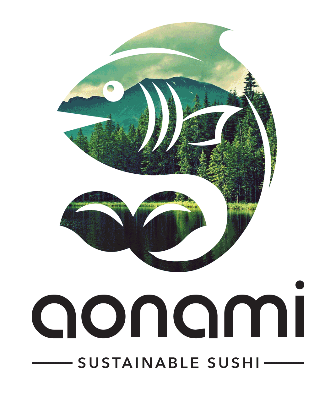
Aonami was a sustainable sushi restaurant in need of a logo that reflected their brand values. The logo not only had to communicate that they serve quality Japanese cuisine, but also that sustainability is always top of mind.

THE SOLUTION
Drawing inspiration from japanese art styles, I developed a minimalist logomark of a fish with a tail in the shape of sprouting leaves, representing sushi and sustainability. A dynamic element was added to the brand where the mark was filled with images of various natural environments to express the importance and beauty of biodiversity. The logotype was custom made to compliment the curvatures of the logomark.
PRINT & PACKAGING APPLICATIONS


WEB & MOBILE APPLICATIONS


PROCESS
-
Market & competitor design research
-
Sketching
-
Logo creation
-
Dynamic element integration
-
Print & web asset development
ROLE
This was a project assigned during the final semester of CSU Chico's communication design undergraduate degree. We were prompted to select a local business, redesign their logo, include a dynamic element and show how the brand changes in different applications.